Nicholas Gamolin — Portfolio
Design Language
The system behind nicholasgamolin.com — 190 tokens, 18 type roles and 8 motion presets, all authored in one manifest and read live from the browser. Nothing below is a picture of the system. It is the system, running.
Principles
Three ideas that every design decision should reinforce.
Editorial layout, modern interface
The page is laid out like print — a full screen per idea, an index numeral and a rule to say where you are in the sequence, one measure to read down. The things you touch are not: they are interface, and they behave like software.
Black is the canvas
The chrome stays monochrome — pure black, white, and glass. Color belongs to the work: project imagery, 3D scenes, and experiments provide every hue, so they always read as the brightest thing on screen.
Motion is the signature
Nothing snaps. Buttons roll their labels, thumbnails bloom into color, underlines grow from the left and collapse off to the right, pages transition through the loading screen. Every interaction is choreographed with intent.
Depth over decoration
Hierarchy comes from layers of glass — low-alpha fills, hairline borders, backdrop blur — not from drop shadows or heavy outlines. Surfaces let the canvas show through.
Registers
Four voices, one per job. Before anything else is decided about a surface, it is decided which of these it belongs to — and that answer picks the typeface, the scale and the layout. Nothing on the site is in two of them at once.
Branding
Montserrat 800Branding
Full-screen sectional compositions. Display type, clamped against the viewport, uppercase and tightly led — a poster, not a paragraph.
The hero, and every numbered section of the home page.
Interface
MontserratInterface
The things you operate. Small, uppercase, widely tracked, so a control never reads as prose no matter where it sits.
The masthead, every button, filters, control panels.
Reading
Montserrat 500Reading
Long-form text, set at a 68ch measure with rhythm that distinguishes a heading's paragraph from the next one.
About, and every experiment write-up.
Technical
JetBrains MonoTechnical
Code, data and diagnostics. Monospaced because alignment carries meaning here in a way it does not anywhere else.
Token readouts, debug chrome, experiment metrics.
Branding
The mark, the icons, and the images every platform pulls out of the page and renders somewhere this system has no control over — a browser tab, a home screen, a link preview in someone's group chat.
The mark
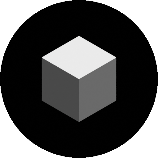

128 · 64 · 32 · 16pxAn isometric cube, flat-shaded in three values off the same white the interface uses. It reads at 16px in a browser tab and at 512px on a splash screen without a second drawing — which is the entire job of a mark.
App icons
Next.js wires the first three up by file name alone — drop an image at the path and it lands in the page's <head> with no code change. The Android pair is referenced from app/manifest.json. Shown at true relative scale.
Favicon
app/favicon.icoMulti-resolution .ico — browser tabs, bookmarks, history
File conventionIcon
app/icon.png32×32 — the modern browser tab icon
File convention
Apple touch icon
app/apple-icon.png180×180 — iOS home screen, Safari pinned tabs
File convention
Android icon
public/android-chrome-192x192.png192×192 — Android home screen
manifest.jsonAndroid icon, large
public/android-chrome-512x512.png512×512 — splash screens and high-DPI displays
manifest.jsonLink previews
Nicholas Gamolin
A showcase of my work as a digital artist and full-stack software engineer.
nicholasgamolin.com
Open Graph
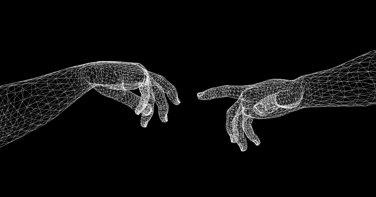
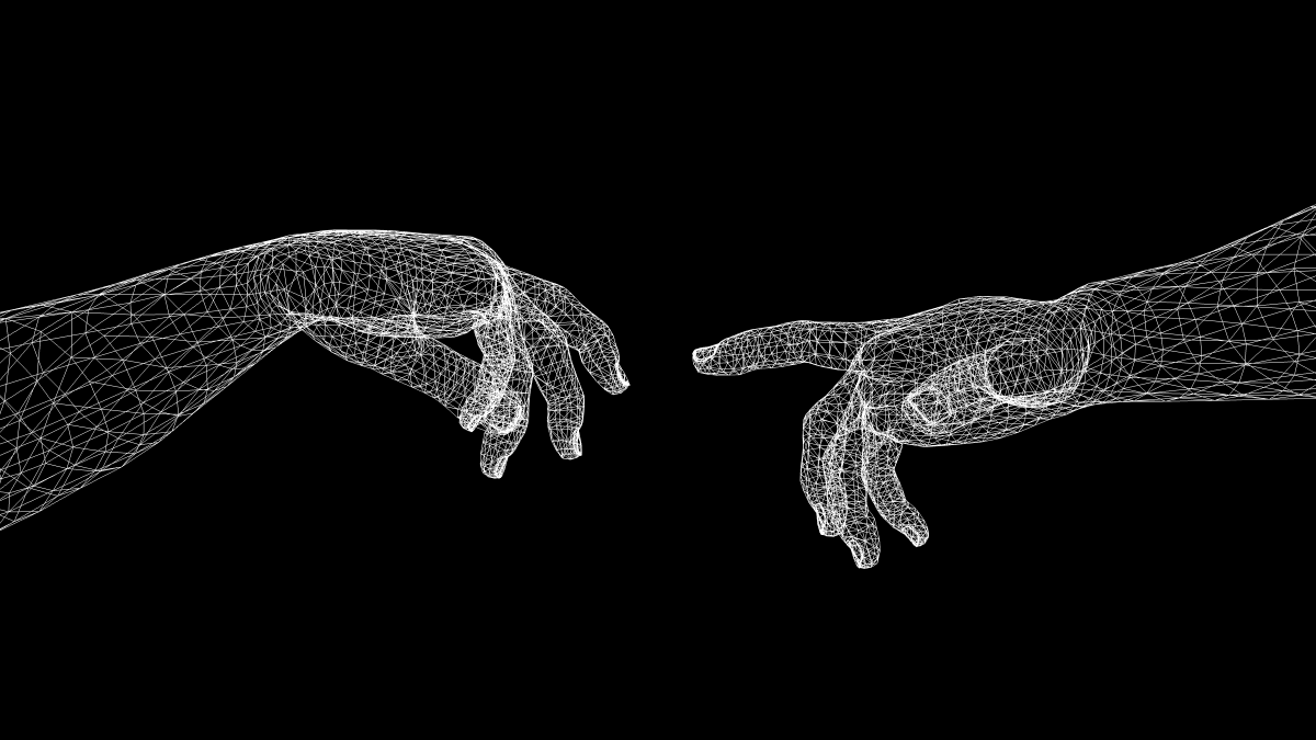
app/opengraph-image.png1200 × 630The picture in every iMessage, Slack and Discord link preview
Nicholas Gamolin
A showcase of my work as a digital artist and full-stack software engineer.
nicholasgamolin.com
X card
app/twitter-image.png1200 × 675summary_large_image — the wide preview on X
One drawing, two crops. Both files sit in app/, so Next wires them by file name — and reads their pixel dimensions, their content type and the adjacent .alt.txt off the disk, none of which hand-written metadata gets for free. The rule to remember is the fallback rule: Next reaches for these files only when the segment's own metadata does not own an images key. The root layout used to declare one — a 512×512 /icon-square.png padded into a 1.91:1 slot — and because that object is what every child route inherits, it shadowed both files site-wide. Dropping the key is what turned them on.
Not yet designed
Every slot below is at its real aspect ratio, so the list is a set of holes rather than a set of filenames. What is left is the mark in its other forms — nothing here blocks the site, and none of it is on the path a shared link takes.
Maskable icon
public/icons/maskable-icon.png512×512 with a ~40% safe zone — lets Android crop the icon to its own shape without clipping the mark
Wordmark
public/branding/wordmark.svgName set as type, no mark — footers and tight horizontal space
Full lockup
public/branding/lockup.svgMark plus wordmark, horizontal — the signature on shared work
What every page declares
Site-level values, set once in the root layout and inherited by every route. A page overrides only what is genuinely its own — a title, a description, and on a project page, a picture.
Title
Nicholas Gamolin
title.defaultTitle template
%s — Nicholas Gamolin
app/layout.jsDescription
A showcase of my work as a digital artist and full-stack software engineer.
app/layout.jsCanonical origin
https://nicholasgamolin.com
metadataBaseCanonical URL
“./” — resolved against each route, not pinned to the homepage
alternatesLink preview image
1200×630, with its alt text — inherited by every route
app/opengraph-image.pngX card
summary_large_image at 1200×675
app/twitter-image.pngX attribution
@nickamolin
lib/socialLinks.tsTheme color
#000000
viewportInstalled app name
Nicholas Gamolin
app/manifest.jsonDisplay mode
standalone, black background
app/manifest.jsonCrawlers
Everything indexable, sitemap advertised
app/robots.tsSitemap
Static routes, listed experiments, and every visible project
app/sitemap.tsWhat is deliberately missing from that list is a share title and a share description. Leaving both unset is what makes them follow the page instead of the site: Next fills og:title and og:description from whatever each route resolved, so a link to this page carries this page's name rather than the homepage's. Naming them here would freeze one sentence onto every link the site ever produces — which is precisely what it used to do.
Metadata
What every route actually puts in the document — title, description, canonical, link preview — read back off the rendered pages rather than described. The branding section above says what the rules are; this says what came out of them.
How this was captured
Not re-derived — read back off the rendered pages of a real server and committed as a snapshot, so what is printed below is literally what the site put in the document. Build fingerprints are stripped from the asset URLs, since they change on every build and mean nothing about identity.
Routes
26
Captured
August 24, 2026 at 11:32 PM UTC
Source
http://localhost:3055
Refresh
npm run metadata
Capture against a production server rather than the dev one — next dev caches renders by content hash and will happily serve a title from before your last edit. Build to a scratch directory, serve that, and point the script at it:
npm run build:check
BUILD_DIR=.next-check npx next start -p 3055
METADATA_ORIGIN=http://localhost:3055 npm run metadata
Every route, collapsed. The summary carries the two things that should never match another page — the title and the description — and opening one shows the complete head. Inside, a value that reads bright is the route's own; a dim one is inherited from the root layout unchanged. Everything is server-rendered, so the browser's own find works across all of it.
Site — 4 routes
/Nicholas GamolinA showcase of my work as a digital artist and full-stack software engineer.27
- theme-color
- #000000
- description
- A showcase of my work as a digital artist and full-stack software engineer.
- manifest
- /manifest.json
- canonical
- https://nicholasgamolin.com
- og:title
- Nicholas Gamolin
- og:description
- A showcase of my work as a digital artist and full-stack software engineer.
- og:url
- https://nicholasgamolin.com
- og:site_name
- Nicholas Gamolin
- og:image:type
- image/png
- og:image:width
- 1200
- og:image:height
- 630
- og:image:alt
- Two hands reaching toward one another, drawn as a white wireframe mesh on black — the Nicholas Gamolin portfolio.
- og:image
- https://nicholasgamolin.com/opengraph-image.png
- og:type
- website
- twitter:card
- summary_large_image
- twitter:site
- @nickamolin
- twitter:creator
- @nickamolin
- twitter:title
- Nicholas Gamolin
- twitter:description
- A showcase of my work as a digital artist and full-stack software engineer.
- twitter:image:type
- image/png
- twitter:image:width
- 1200
- twitter:image:height
- 675
- twitter:image:alt
- Two hands reaching toward one another, drawn as a white wireframe mesh on black — the Nicholas Gamolin portfolio.
- twitter:image
- https://nicholasgamolin.com/twitter-image.png
- icon
- /favicon.ico
- icon
- /icon.png
- apple-touch-icon
- /apple-icon.png
/aboutAbout — Nicholas GamolinMy background, professional experience, and how I work.27
- theme-color
- #000000
- description
- My background, professional experience, and how I work.
- manifest
- /manifest.json
- canonical
- https://nicholasgamolin.com/about
- og:title
- About — Nicholas Gamolin
- og:description
- My background, professional experience, and how I work.
- og:url
- https://nicholasgamolin.com/about
- og:site_name
- Nicholas Gamolin
- og:image:type
- image/png
- og:image:width
- 1200
- og:image:height
- 630
- og:image:alt
- Two hands reaching toward one another, drawn as a white wireframe mesh on black — the Nicholas Gamolin portfolio.
- og:image
- https://nicholasgamolin.com/opengraph-image.png
- og:type
- website
- twitter:card
- summary_large_image
- twitter:site
- @nickamolin
- twitter:creator
- @nickamolin
- twitter:title
- About — Nicholas Gamolin
- twitter:description
- My background, professional experience, and how I work.
- twitter:image:type
- image/png
- twitter:image:width
- 1200
- twitter:image:height
- 675
- twitter:image:alt
- Two hands reaching toward one another, drawn as a white wireframe mesh on black — the Nicholas Gamolin portfolio.
- twitter:image
- https://nicholasgamolin.com/twitter-image.png
- icon
- /favicon.ico
- icon
- /icon.png
- apple-touch-icon
- /apple-icon.png
/design-languageDesign Language — Nicholas GamolinThe design system behind nicholasgamolin.com, demonstrated: color, typography, spacing, shape, motion, glass, layering and the brand assets.27
- theme-color
- #000000
- description
- The design system behind nicholasgamolin.com, demonstrated: color, typography, spacing, shape, motion, glass, layering and the brand assets.
- manifest
- /manifest.json
- canonical
- https://nicholasgamolin.com/design-language
- og:title
- Design Language — Nicholas Gamolin
- og:description
- The design system behind nicholasgamolin.com, demonstrated: color, typography, spacing, shape, motion, glass, layering and the brand assets.
- og:url
- https://nicholasgamolin.com/design-language
- og:site_name
- Nicholas Gamolin
- og:image:type
- image/png
- og:image:width
- 1200
- og:image:height
- 630
- og:image:alt
- Two hands reaching toward one another, drawn as a white wireframe mesh on black — the Nicholas Gamolin portfolio.
- og:image
- https://nicholasgamolin.com/opengraph-image.png
- og:type
- website
- twitter:card
- summary_large_image
- twitter:site
- @nickamolin
- twitter:creator
- @nickamolin
- twitter:title
- Design Language — Nicholas Gamolin
- twitter:description
- The design system behind nicholasgamolin.com, demonstrated: color, typography, spacing, shape, motion, glass, layering and the brand assets.
- twitter:image:type
- image/png
- twitter:image:width
- 1200
- twitter:image:height
- 675
- twitter:image:alt
- Two hands reaching toward one another, drawn as a white wireframe mesh on black — the Nicholas Gamolin portfolio.
- twitter:image
- https://nicholasgamolin.com/twitter-image.png
- icon
- /favicon.ico
- icon
- /icon.png
- apple-touch-icon
- /apple-icon.png
/projectsProjects — Nicholas GamolinMy work spanning web, motion graphics, and game design.27
- theme-color
- #000000
- description
- My work spanning web, motion graphics, and game design.
- manifest
- /manifest.json
- canonical
- https://nicholasgamolin.com/projects
- og:title
- Projects — Nicholas Gamolin
- og:description
- My work spanning web, motion graphics, and game design.
- og:url
- https://nicholasgamolin.com/projects
- og:site_name
- Nicholas Gamolin
- og:image:type
- image/png
- og:image:width
- 1200
- og:image:height
- 630
- og:image:alt
- Two hands reaching toward one another, drawn as a white wireframe mesh on black — the Nicholas Gamolin portfolio.
- og:image
- https://nicholasgamolin.com/opengraph-image.png
- og:type
- website
- twitter:card
- summary_large_image
- twitter:site
- @nickamolin
- twitter:creator
- @nickamolin
- twitter:title
- Projects — Nicholas Gamolin
- twitter:description
- My work spanning web, motion graphics, and game design.
- twitter:image:type
- image/png
- twitter:image:width
- 1200
- twitter:image:height
- 675
- twitter:image:alt
- Two hands reaching toward one another, drawn as a white wireframe mesh on black — the Nicholas Gamolin portfolio.
- twitter:image
- https://nicholasgamolin.com/twitter-image.png
- icon
- /favicon.ico
- icon
- /icon.png
- apple-touch-icon
- /apple-icon.png
Playground — 13 routes
/playgroundPlayground — Nicholas GamolinA hidden playground of interactive experiments.27
- theme-color
- #000000
- description
- A hidden playground of interactive experiments.
- manifest
- /manifest.json
- canonical
- https://nicholasgamolin.com/playground
- og:title
- Playground — Nicholas Gamolin
- og:description
- A hidden playground of interactive experiments.
- og:url
- https://nicholasgamolin.com/playground
- og:site_name
- Nicholas Gamolin
- og:image:type
- image/png
- og:image:width
- 1200
- og:image:height
- 630
- og:image:alt
- Two hands reaching toward one another, drawn as a white wireframe mesh on black — the Nicholas Gamolin portfolio.
- og:image
- https://nicholasgamolin.com/opengraph-image.png
- og:type
- website
- twitter:card
- summary_large_image
- twitter:site
- @nickamolin
- twitter:creator
- @nickamolin
- twitter:title
- Playground — Nicholas Gamolin
- twitter:description
- A hidden playground of interactive experiments.
- twitter:image:type
- image/png
- twitter:image:width
- 1200
- twitter:image:height
- 675
- twitter:image:alt
- Two hands reaching toward one another, drawn as a white wireframe mesh on black — the Nicholas Gamolin portfolio.
- twitter:image
- https://nicholasgamolin.com/twitter-image.png
- icon
- /favicon.ico
- icon
- /icon.png
- apple-touch-icon
- /apple-icon.png
/playground/animationAnimation Techniques — Nicholas GamolinGLB animation and pre-rendered sprite playback experiments.27
- theme-color
- #000000
- description
- GLB animation and pre-rendered sprite playback experiments.
- manifest
- /manifest.json
- canonical
- https://nicholasgamolin.com/playground/animation
- og:title
- Animation Techniques — Nicholas Gamolin
- og:description
- GLB animation and pre-rendered sprite playback experiments.
- og:url
- https://nicholasgamolin.com/playground/animation
- og:site_name
- Nicholas Gamolin
- og:image:type
- image/png
- og:image:width
- 1200
- og:image:height
- 630
- og:image:alt
- Two hands reaching toward one another, drawn as a white wireframe mesh on black — the Nicholas Gamolin portfolio.
- og:image
- https://nicholasgamolin.com/opengraph-image.png
- og:type
- website
- twitter:card
- summary_large_image
- twitter:site
- @nickamolin
- twitter:creator
- @nickamolin
- twitter:title
- Animation Techniques — Nicholas Gamolin
- twitter:description
- GLB animation and pre-rendered sprite playback experiments.
- twitter:image:type
- image/png
- twitter:image:width
- 1200
- twitter:image:height
- 675
- twitter:image:alt
- Two hands reaching toward one another, drawn as a white wireframe mesh on black — the Nicholas Gamolin portfolio.
- twitter:image
- https://nicholasgamolin.com/twitter-image.png
- icon
- /favicon.ico
- icon
- /icon.png
- apple-touch-icon
- /apple-icon.png
/playground/bento-gridBento Grid — Nicholas GamolinA recursive binary partition of the art collection, where every cell takes the shape of the work inside it.27
- theme-color
- #000000
- description
- A recursive binary partition of the art collection, where every cell takes the shape of the work inside it.
- manifest
- /manifest.json
- canonical
- https://nicholasgamolin.com/playground/bento-grid
- og:title
- Bento Grid — Nicholas Gamolin
- og:description
- A recursive binary partition of the art collection, where every cell takes the shape of the work inside it.
- og:url
- https://nicholasgamolin.com/playground/bento-grid
- og:site_name
- Nicholas Gamolin
- og:image:type
- image/png
- og:image:width
- 1200
- og:image:height
- 630
- og:image:alt
- Two hands reaching toward one another, drawn as a white wireframe mesh on black — the Nicholas Gamolin portfolio.
- og:image
- https://nicholasgamolin.com/opengraph-image.png
- og:type
- website
- twitter:card
- summary_large_image
- twitter:site
- @nickamolin
- twitter:creator
- @nickamolin
- twitter:title
- Bento Grid — Nicholas Gamolin
- twitter:description
- A recursive binary partition of the art collection, where every cell takes the shape of the work inside it.
- twitter:image:type
- image/png
- twitter:image:width
- 1200
- twitter:image:height
- 675
- twitter:image:alt
- Two hands reaching toward one another, drawn as a white wireframe mesh on black — the Nicholas Gamolin portfolio.
- twitter:image
- https://nicholasgamolin.com/twitter-image.png
- icon
- /favicon.ico
- icon
- /icon.png
- apple-touch-icon
- /apple-icon.png
/playground/brand-assetsBrand Assets — Nicholas GamolinIcons and banners rendered from the site's own models, exported at exact pixel sizes.27
- theme-color
- #000000
- description
- Icons and banners rendered from the site's own models, exported at exact pixel sizes.
- manifest
- /manifest.json
- canonical
- https://nicholasgamolin.com/playground/brand-assets
- og:title
- Brand Assets — Nicholas Gamolin
- og:description
- Icons and banners rendered from the site's own models, exported at exact pixel sizes.
- og:url
- https://nicholasgamolin.com/playground/brand-assets
- og:site_name
- Nicholas Gamolin
- og:image:type
- image/png
- og:image:width
- 1200
- og:image:height
- 630
- og:image:alt
- Two hands reaching toward one another, drawn as a white wireframe mesh on black — the Nicholas Gamolin portfolio.
- og:image
- https://nicholasgamolin.com/opengraph-image.png
- og:type
- website
- twitter:card
- summary_large_image
- twitter:site
- @nickamolin
- twitter:creator
- @nickamolin
- twitter:title
- Brand Assets — Nicholas Gamolin
- twitter:description
- Icons and banners rendered from the site's own models, exported at exact pixel sizes.
- twitter:image:type
- image/png
- twitter:image:width
- 1200
- twitter:image:height
- 675
- twitter:image:alt
- Two hands reaching toward one another, drawn as a white wireframe mesh on black — the Nicholas Gamolin portfolio.
- twitter:image
- https://nicholasgamolin.com/twitter-image.png
- icon
- /favicon.ico
- icon
- /icon.png
- apple-touch-icon
- /apple-icon.png
/playground/buttonsUI Primitives — Nicholas GamolinComparing and migrating custom UI components to shadcn primitives.27
- theme-color
- #000000
- description
- Comparing and migrating custom UI components to shadcn primitives.
- manifest
- /manifest.json
- canonical
- https://nicholasgamolin.com/playground/buttons
- og:title
- UI Primitives — Nicholas Gamolin
- og:description
- Comparing and migrating custom UI components to shadcn primitives.
- og:url
- https://nicholasgamolin.com/playground/buttons
- og:site_name
- Nicholas Gamolin
- og:image:type
- image/png
- og:image:width
- 1200
- og:image:height
- 630
- og:image:alt
- Two hands reaching toward one another, drawn as a white wireframe mesh on black — the Nicholas Gamolin portfolio.
- og:image
- https://nicholasgamolin.com/opengraph-image.png
- og:type
- website
- twitter:card
- summary_large_image
- twitter:site
- @nickamolin
- twitter:creator
- @nickamolin
- twitter:title
- UI Primitives — Nicholas Gamolin
- twitter:description
- Comparing and migrating custom UI components to shadcn primitives.
- twitter:image:type
- image/png
- twitter:image:width
- 1200
- twitter:image:height
- 675
- twitter:image:alt
- Two hands reaching toward one another, drawn as a white wireframe mesh on black — the Nicholas Gamolin portfolio.
- twitter:image
- https://nicholasgamolin.com/twitter-image.png
- icon
- /favicon.ico
- icon
- /icon.png
- apple-touch-icon
- /apple-icon.png
/playground/glass-librariesGlass Comparison — Nicholas GamolinThe same scene and lens through three glass implementations: a hand-built SVG filter against two published WebGL libraries.27
- theme-color
- #000000
- description
- The same scene and lens through three glass implementations: a hand-built SVG filter against two published WebGL libraries.
- manifest
- /manifest.json
- canonical
- https://nicholasgamolin.com/playground/glass-libraries
- og:title
- Glass Comparison — Nicholas Gamolin
- og:description
- The same scene and lens through three glass implementations: a hand-built SVG filter against two published WebGL libraries.
- og:url
- https://nicholasgamolin.com/playground/glass-libraries
- og:site_name
- Nicholas Gamolin
- og:image:type
- image/png
- og:image:width
- 1200
- og:image:height
- 630
- og:image:alt
- Two hands reaching toward one another, drawn as a white wireframe mesh on black — the Nicholas Gamolin portfolio.
- og:image
- https://nicholasgamolin.com/opengraph-image.png
- og:type
- website
- twitter:card
- summary_large_image
- twitter:site
- @nickamolin
- twitter:creator
- @nickamolin
- twitter:title
- Glass Comparison — Nicholas Gamolin
- twitter:description
- The same scene and lens through three glass implementations: a hand-built SVG filter against two published WebGL libraries.
- twitter:image:type
- image/png
- twitter:image:width
- 1200
- twitter:image:height
- 675
- twitter:image:alt
- Two hands reaching toward one another, drawn as a white wireframe mesh on black — the Nicholas Gamolin portfolio.
- twitter:image
- https://nicholasgamolin.com/twitter-image.png
- icon
- /favicon.ico
- icon
- /icon.png
- apple-touch-icon
- /apple-icon.png
/playground/gyroscopeGyroscope — Nicholas GamolinA joystick drift visualizer steered by device tilt, or by the cursor.27
- theme-color
- #000000
- description
- A joystick drift visualizer steered by device tilt, or by the cursor.
- manifest
- /manifest.json
- canonical
- https://nicholasgamolin.com/playground/gyroscope
- og:title
- Gyroscope — Nicholas Gamolin
- og:description
- A joystick drift visualizer steered by device tilt, or by the cursor.
- og:url
- https://nicholasgamolin.com/playground/gyroscope
- og:site_name
- Nicholas Gamolin
- og:image:type
- image/png
- og:image:width
- 1200
- og:image:height
- 630
- og:image:alt
- Two hands reaching toward one another, drawn as a white wireframe mesh on black — the Nicholas Gamolin portfolio.
- og:image
- https://nicholasgamolin.com/opengraph-image.png
- og:type
- website
- twitter:card
- summary_large_image
- twitter:site
- @nickamolin
- twitter:creator
- @nickamolin
- twitter:title
- Gyroscope — Nicholas Gamolin
- twitter:description
- A joystick drift visualizer steered by device tilt, or by the cursor.
- twitter:image:type
- image/png
- twitter:image:width
- 1200
- twitter:image:height
- 675
- twitter:image:alt
- Two hands reaching toward one another, drawn as a white wireframe mesh on black — the Nicholas Gamolin portfolio.
- twitter:image
- https://nicholasgamolin.com/twitter-image.png
- icon
- /favicon.ico
- icon
- /icon.png
- apple-touch-icon
- /apple-icon.png
/playground/liquid-glassLiquid Glass — Nicholas GamolinA hand-built SVG displacement-map lens that refracts the live DOM — how it works, what it costs, and how it compares to the published WebGL libraries.27
- theme-color
- #000000
- description
- A hand-built SVG displacement-map lens that refracts the live DOM — how it works, what it costs, and how it compares to the published WebGL libraries.
- manifest
- /manifest.json
- canonical
- https://nicholasgamolin.com/playground/liquid-glass
- og:title
- Liquid Glass — Nicholas Gamolin
- og:description
- A hand-built SVG displacement-map lens that refracts the live DOM — how it works, what it costs, and how it compares to the published WebGL libraries.
- og:url
- https://nicholasgamolin.com/playground/liquid-glass
- og:site_name
- Nicholas Gamolin
- og:image:type
- image/png
- og:image:width
- 1200
- og:image:height
- 630
- og:image:alt
- Two hands reaching toward one another, drawn as a white wireframe mesh on black — the Nicholas Gamolin portfolio.
- og:image
- https://nicholasgamolin.com/opengraph-image.png
- og:type
- website
- twitter:card
- summary_large_image
- twitter:site
- @nickamolin
- twitter:creator
- @nickamolin
- twitter:title
- Liquid Glass — Nicholas Gamolin
- twitter:description
- A hand-built SVG displacement-map lens that refracts the live DOM — how it works, what it costs, and how it compares to the published WebGL libraries.
- twitter:image:type
- image/png
- twitter:image:width
- 1200
- twitter:image:height
- 675
- twitter:image:alt
- Two hands reaching toward one another, drawn as a white wireframe mesh on black — the Nicholas Gamolin portfolio.
- twitter:image
- https://nicholasgamolin.com/twitter-image.png
- icon
- /favicon.ico
- icon
- /icon.png
- apple-touch-icon
- /apple-icon.png
/playground/liquid-glass-3d3D Liquid Glass — Nicholas GamolinGenerating the displacement map with three.js instead of a CPU signed-distance field, so an animated 3D form refracts the live DOM — and trimming the filter chain from thirteen passes to four.27
- theme-color
- #000000
- description
- Generating the displacement map with three.js instead of a CPU signed-distance field, so an animated 3D form refracts the live DOM — and trimming the filter chain from thirteen passes to four.
- manifest
- /manifest.json
- canonical
- https://nicholasgamolin.com/playground/liquid-glass-3d
- og:title
- 3D Liquid Glass — Nicholas Gamolin
- og:description
- Generating the displacement map with three.js instead of a CPU signed-distance field, so an animated 3D form refracts the live DOM — and trimming the filter chain from thirteen passes to four.
- og:url
- https://nicholasgamolin.com/playground/liquid-glass-3d
- og:site_name
- Nicholas Gamolin
- og:image:type
- image/png
- og:image:width
- 1200
- og:image:height
- 630
- og:image:alt
- Two hands reaching toward one another, drawn as a white wireframe mesh on black — the Nicholas Gamolin portfolio.
- og:image
- https://nicholasgamolin.com/opengraph-image.png
- og:type
- website
- twitter:card
- summary_large_image
- twitter:site
- @nickamolin
- twitter:creator
- @nickamolin
- twitter:title
- 3D Liquid Glass — Nicholas Gamolin
- twitter:description
- Generating the displacement map with three.js instead of a CPU signed-distance field, so an animated 3D form refracts the live DOM — and trimming the filter chain from thirteen passes to four.
- twitter:image:type
- image/png
- twitter:image:width
- 1200
- twitter:image:height
- 675
- twitter:image:alt
- Two hands reaching toward one another, drawn as a white wireframe mesh on black — the Nicholas Gamolin portfolio.
- twitter:image
- https://nicholasgamolin.com/twitter-image.png
- icon
- /favicon.ico
- icon
- /icon.png
- apple-touch-icon
- /apple-icon.png
/playground/procedural-animationsProcedural Animations — Nicholas GamolinThe loading animation keyframed and rebuilt in code, a cube that fits itself to the viewport, and a model that follows the cursor.27
- theme-color
- #000000
- description
- The loading animation keyframed and rebuilt in code, a cube that fits itself to the viewport, and a model that follows the cursor.
- manifest
- /manifest.json
- canonical
- https://nicholasgamolin.com/playground/procedural-animations
- og:title
- Procedural Animations — Nicholas Gamolin
- og:description
- The loading animation keyframed and rebuilt in code, a cube that fits itself to the viewport, and a model that follows the cursor.
- og:url
- https://nicholasgamolin.com/playground/procedural-animations
- og:site_name
- Nicholas Gamolin
- og:image:type
- image/png
- og:image:width
- 1200
- og:image:height
- 630
- og:image:alt
- Two hands reaching toward one another, drawn as a white wireframe mesh on black — the Nicholas Gamolin portfolio.
- og:image
- https://nicholasgamolin.com/opengraph-image.png
- og:type
- website
- twitter:card
- summary_large_image
- twitter:site
- @nickamolin
- twitter:creator
- @nickamolin
- twitter:title
- Procedural Animations — Nicholas Gamolin
- twitter:description
- The loading animation keyframed and rebuilt in code, a cube that fits itself to the viewport, and a model that follows the cursor.
- twitter:image:type
- image/png
- twitter:image:width
- 1200
- twitter:image:height
- 675
- twitter:image:alt
- Two hands reaching toward one another, drawn as a white wireframe mesh on black — the Nicholas Gamolin portfolio.
- twitter:image
- https://nicholasgamolin.com/twitter-image.png
- icon
- /favicon.ico
- icon
- /icon.png
- apple-touch-icon
- /apple-icon.png
/playground/procedural-materialsProcedural Materials — Nicholas GamolinSix procedural Three.js materials, tuned live and compared on a shared form.27
- theme-color
- #000000
- description
- Six procedural Three.js materials, tuned live and compared on a shared form.
- manifest
- /manifest.json
- canonical
- https://nicholasgamolin.com/playground/procedural-materials
- og:title
- Procedural Materials — Nicholas Gamolin
- og:description
- Six procedural Three.js materials, tuned live and compared on a shared form.
- og:url
- https://nicholasgamolin.com/playground/procedural-materials
- og:site_name
- Nicholas Gamolin
- og:image:type
- image/png
- og:image:width
- 1200
- og:image:height
- 630
- og:image:alt
- Two hands reaching toward one another, drawn as a white wireframe mesh on black — the Nicholas Gamolin portfolio.
- og:image
- https://nicholasgamolin.com/opengraph-image.png
- og:type
- website
- twitter:card
- summary_large_image
- twitter:site
- @nickamolin
- twitter:creator
- @nickamolin
- twitter:title
- Procedural Materials — Nicholas Gamolin
- twitter:description
- Six procedural Three.js materials, tuned live and compared on a shared form.
- twitter:image:type
- image/png
- twitter:image:width
- 1200
- twitter:image:height
- 675
- twitter:image:alt
- Two hands reaching toward one another, drawn as a white wireframe mesh on black — the Nicholas Gamolin portfolio.
- twitter:image
- https://nicholasgamolin.com/twitter-image.png
- icon
- /favicon.ico
- icon
- /icon.png
- apple-touch-icon
- /apple-icon.png
/playground/refractionRefraction Techniques — Nicholas GamolinScreen-space, virtual-plane, and html-to-image refraction experiments.27
- theme-color
- #000000
- description
- Screen-space, virtual-plane, and html-to-image refraction experiments.
- manifest
- /manifest.json
- canonical
- https://nicholasgamolin.com/playground/refraction
- og:title
- Refraction Techniques — Nicholas Gamolin
- og:description
- Screen-space, virtual-plane, and html-to-image refraction experiments.
- og:url
- https://nicholasgamolin.com/playground/refraction
- og:site_name
- Nicholas Gamolin
- og:image:type
- image/png
- og:image:width
- 1200
- og:image:height
- 630
- og:image:alt
- Two hands reaching toward one another, drawn as a white wireframe mesh on black — the Nicholas Gamolin portfolio.
- og:image
- https://nicholasgamolin.com/opengraph-image.png
- og:type
- website
- twitter:card
- summary_large_image
- twitter:site
- @nickamolin
- twitter:creator
- @nickamolin
- twitter:title
- Refraction Techniques — Nicholas Gamolin
- twitter:description
- Screen-space, virtual-plane, and html-to-image refraction experiments.
- twitter:image:type
- image/png
- twitter:image:width
- 1200
- twitter:image:height
- 675
- twitter:image:alt
- Two hands reaching toward one another, drawn as a white wireframe mesh on black — the Nicholas Gamolin portfolio.
- twitter:image
- https://nicholasgamolin.com/twitter-image.png
- icon
- /favicon.ico
- icon
- /icon.png
- apple-touch-icon
- /apple-icon.png
/playground/typographyTypography — Nicholas GamolinEvery font in the project, side by side with the live typescale.27
- theme-color
- #000000
- description
- Every font in the project, side by side with the live typescale.
- manifest
- /manifest.json
- canonical
- https://nicholasgamolin.com/playground/typography
- og:title
- Typography — Nicholas Gamolin
- og:description
- Every font in the project, side by side with the live typescale.
- og:url
- https://nicholasgamolin.com/playground/typography
- og:site_name
- Nicholas Gamolin
- og:image:type
- image/png
- og:image:width
- 1200
- og:image:height
- 630
- og:image:alt
- Two hands reaching toward one another, drawn as a white wireframe mesh on black — the Nicholas Gamolin portfolio.
- og:image
- https://nicholasgamolin.com/opengraph-image.png
- og:type
- website
- twitter:card
- summary_large_image
- twitter:site
- @nickamolin
- twitter:creator
- @nickamolin
- twitter:title
- Typography — Nicholas Gamolin
- twitter:description
- Every font in the project, side by side with the live typescale.
- twitter:image:type
- image/png
- twitter:image:width
- 1200
- twitter:image:height
- 675
- twitter:image:alt
- Two hands reaching toward one another, drawn as a white wireframe mesh on black — the Nicholas Gamolin portfolio.
- twitter:image
- https://nicholasgamolin.com/twitter-image.png
- icon
- /favicon.ico
- icon
- /icon.png
- apple-touch-icon
- /apple-icon.png
Projects — 9 routes
/projects/brick-diggerBrick Digger — Nicholas GamolinEndless Arcade Game21
- theme-color
- #000000
- description
- Endless Arcade Game
- manifest
- /manifest.json
- canonical
- https://nicholasgamolin.com/projects/brick-digger
- og:title
- Brick Digger — Nicholas Gamolin
- og:description
- Endless Arcade Game
- og:url
- https://nicholasgamolin.com/projects/brick-digger
- og:site_name
- Nicholas Gamolin
- og:image
- https://ahkkpmqdyghygygqonbi.supabase.co/storage/v1/object/public/project-thumbnails/Project%20Thumbnails/BrickDiggerThumbnailSquare.png
- og:image:alt
- Brick Digger
- og:type
- website
- twitter:card
- summary_large_image
- twitter:site
- @nickamolin
- twitter:creator
- @nickamolin
- twitter:title
- Brick Digger — Nicholas Gamolin
- twitter:description
- Endless Arcade Game
- twitter:image
- https://ahkkpmqdyghygygqonbi.supabase.co/storage/v1/object/public/project-thumbnails/Project%20Thumbnails/BrickDiggerThumbnailSquare.png
- twitter:image:alt
- Brick Digger
- icon
- /favicon.ico
- icon
- /icon.png
- apple-touch-icon
- /apple-icon.png
/projects/calc-visionCalc Vision — Nicholas Gamolin3D & 2D Graphing Calculator21
- theme-color
- #000000
- description
- 3D & 2D Graphing Calculator
- manifest
- /manifest.json
- canonical
- https://nicholasgamolin.com/projects/calc-vision
- og:title
- Calc Vision — Nicholas Gamolin
- og:description
- 3D & 2D Graphing Calculator
- og:url
- https://nicholasgamolin.com/projects/calc-vision
- og:site_name
- Nicholas Gamolin
- og:image
- https://ahkkpmqdyghygygqonbi.supabase.co/storage/v1/object/public/project-thumbnails/Project%20Thumbnails/calcVisionDemoSquare.jpg
- og:image:alt
- Calc Vision
- og:type
- website
- twitter:card
- summary_large_image
- twitter:site
- @nickamolin
- twitter:creator
- @nickamolin
- twitter:title
- Calc Vision — Nicholas Gamolin
- twitter:description
- 3D & 2D Graphing Calculator
- twitter:image
- https://ahkkpmqdyghygygqonbi.supabase.co/storage/v1/object/public/project-thumbnails/Project%20Thumbnails/calcVisionDemoSquare.jpg
- twitter:image:alt
- Calc Vision
- icon
- /favicon.ico
- icon
- /icon.png
- apple-touch-icon
- /apple-icon.png
/projects/endangered-cake-museumEndangered Cake Museum — Nicholas GamolinTop Down Stealth Game21
- theme-color
- #000000
- description
- Top Down Stealth Game
- manifest
- /manifest.json
- canonical
- https://nicholasgamolin.com/projects/endangered-cake-museum
- og:title
- Endangered Cake Museum — Nicholas Gamolin
- og:description
- Top Down Stealth Game
- og:url
- https://nicholasgamolin.com/projects/endangered-cake-museum
- og:site_name
- Nicholas Gamolin
- og:image
- https://ahkkpmqdyghygygqonbi.supabase.co/storage/v1/object/public/project-thumbnails/Project%20Thumbnails/EndangeredCakeMuseumTitleScreenSS.png
- og:image:alt
- Endangered Cake Museum
- og:type
- website
- twitter:card
- summary_large_image
- twitter:site
- @nickamolin
- twitter:creator
- @nickamolin
- twitter:title
- Endangered Cake Museum — Nicholas Gamolin
- twitter:description
- Top Down Stealth Game
- twitter:image
- https://ahkkpmqdyghygygqonbi.supabase.co/storage/v1/object/public/project-thumbnails/Project%20Thumbnails/EndangeredCakeMuseumTitleScreenSS.png
- twitter:image:alt
- Endangered Cake Museum
- icon
- /favicon.ico
- icon
- /icon.png
- apple-touch-icon
- /apple-icon.png
/projects/flourishGet to Know Flourish — Nicholas Gamolin2D Product Intro Animation21
- theme-color
- #000000
- description
- 2D Product Intro Animation
- manifest
- /manifest.json
- canonical
- https://nicholasgamolin.com/projects/flourish
- og:title
- Get to Know Flourish — Nicholas Gamolin
- og:description
- 2D Product Intro Animation
- og:url
- https://nicholasgamolin.com/projects/flourish
- og:site_name
- Nicholas Gamolin
- og:image
- https://ahkkpmqdyghygygqonbi.supabase.co/storage/v1/object/public/project-thumbnails/Project%20Thumbnails/FlourishVideoSS.PNG
- og:image:alt
- Get to Know Flourish
- og:type
- website
- twitter:card
- summary_large_image
- twitter:site
- @nickamolin
- twitter:creator
- @nickamolin
- twitter:title
- Get to Know Flourish — Nicholas Gamolin
- twitter:description
- 2D Product Intro Animation
- twitter:image
- https://ahkkpmqdyghygygqonbi.supabase.co/storage/v1/object/public/project-thumbnails/Project%20Thumbnails/FlourishVideoSS.PNG
- twitter:image:alt
- Get to Know Flourish
- icon
- /favicon.ico
- icon
- /icon.png
- apple-touch-icon
- /apple-icon.png
/projects/glimmrGlimmr.io — Nicholas GamolinMotion Graphics Design21
- theme-color
- #000000
- description
- Motion Graphics Design
- manifest
- /manifest.json
- canonical
- https://nicholasgamolin.com/projects/glimmr
- og:title
- Glimmr.io — Nicholas Gamolin
- og:description
- Motion Graphics Design
- og:url
- https://nicholasgamolin.com/projects/glimmr
- og:site_name
- Nicholas Gamolin
- og:image
- https://ahkkpmqdyghygygqonbi.supabase.co/storage/v1/object/public/project-thumbnails/Project%20Thumbnails/GlimmrLogoDevSquare.PNG
- og:image:alt
- Glimmr.io
- og:type
- website
- twitter:card
- summary_large_image
- twitter:site
- @nickamolin
- twitter:creator
- @nickamolin
- twitter:title
- Glimmr.io — Nicholas Gamolin
- twitter:description
- Motion Graphics Design
- twitter:image
- https://ahkkpmqdyghygygqonbi.supabase.co/storage/v1/object/public/project-thumbnails/Project%20Thumbnails/GlimmrLogoDevSquare.PNG
- twitter:image:alt
- Glimmr.io
- icon
- /favicon.ico
- icon
- /icon.png
- apple-touch-icon
- /apple-icon.png
/projects/harmonyHarmony — Nicholas GamolinMusic Sharing Web-App21
- theme-color
- #000000
- description
- Music Sharing Web-App
- manifest
- /manifest.json
- canonical
- https://nicholasgamolin.com/projects/harmony
- og:title
- Harmony — Nicholas Gamolin
- og:description
- Music Sharing Web-App
- og:url
- https://nicholasgamolin.com/projects/harmony
- og:site_name
- Nicholas Gamolin
- og:image
- https://ahkkpmqdyghygygqonbi.supabase.co/storage/v1/object/public/project-thumbnails/Project%20Thumbnails/Harmony.png
- og:image:alt
- Harmony
- og:type
- website
- twitter:card
- summary_large_image
- twitter:site
- @nickamolin
- twitter:creator
- @nickamolin
- twitter:title
- Harmony — Nicholas Gamolin
- twitter:description
- Music Sharing Web-App
- twitter:image
- https://ahkkpmqdyghygygqonbi.supabase.co/storage/v1/object/public/project-thumbnails/Project%20Thumbnails/Harmony.png
- twitter:image:alt
- Harmony
- icon
- /favicon.ico
- icon
- /icon.png
- apple-touch-icon
- /apple-icon.png
/projects/negative-domainNegative Domain — Nicholas GamolinDigital Art Gallery21
- theme-color
- #000000
- description
- Digital Art Gallery
- manifest
- /manifest.json
- canonical
- https://nicholasgamolin.com/projects/negative-domain
- og:title
- Negative Domain — Nicholas Gamolin
- og:description
- Digital Art Gallery
- og:url
- https://nicholasgamolin.com/projects/negative-domain
- og:site_name
- Nicholas Gamolin
- og:image
- https://ahkkpmqdyghygygqonbi.supabase.co/storage/v1/object/public/project-thumbnails/Project%20Thumbnails/watcherSquare.jpg
- og:image:alt
- Negative Domain
- og:type
- website
- twitter:card
- summary_large_image
- twitter:site
- @nickamolin
- twitter:creator
- @nickamolin
- twitter:title
- Negative Domain — Nicholas Gamolin
- twitter:description
- Digital Art Gallery
- twitter:image
- https://ahkkpmqdyghygygqonbi.supabase.co/storage/v1/object/public/project-thumbnails/Project%20Thumbnails/watcherSquare.jpg
- twitter:image:alt
- Negative Domain
- icon
- /favicon.ico
- icon
- /icon.png
- apple-touch-icon
- /apple-icon.png
/projects/the-riderThe Rider — Nicholas Gamolin3D Animation21
- theme-color
- #000000
- description
- 3D Animation
- manifest
- /manifest.json
- canonical
- https://nicholasgamolin.com/projects/the-rider
- og:title
- The Rider — Nicholas Gamolin
- og:description
- 3D Animation
- og:url
- https://nicholasgamolin.com/projects/the-rider
- og:site_name
- Nicholas Gamolin
- og:image
- https://ahkkpmqdyghygygqonbi.supabase.co/storage/v1/object/public/project-thumbnails/Project%20Thumbnails/TheRiderSquare.jpg
- og:image:alt
- The Rider
- og:type
- website
- twitter:card
- summary_large_image
- twitter:site
- @nickamolin
- twitter:creator
- @nickamolin
- twitter:title
- The Rider — Nicholas Gamolin
- twitter:description
- 3D Animation
- twitter:image
- https://ahkkpmqdyghygygqonbi.supabase.co/storage/v1/object/public/project-thumbnails/Project%20Thumbnails/TheRiderSquare.jpg
- twitter:image:alt
- The Rider
- icon
- /favicon.ico
- icon
- /icon.png
- apple-touch-icon
- /apple-icon.png
/projects/ublockUBlock — Nicholas GamoliniOS Productivity App21
- theme-color
- #000000
- description
- iOS Productivity App
- manifest
- /manifest.json
- canonical
- https://nicholasgamolin.com/projects/ublock
- og:title
- UBlock — Nicholas Gamolin
- og:description
- iOS Productivity App
- og:url
- https://nicholasgamolin.com/projects/ublock
- og:site_name
- Nicholas Gamolin
- og:image
- https://ahkkpmqdyghygygqonbi.supabase.co/storage/v1/object/public/project-thumbnails/Project%20Thumbnails/UBlockAppIcon.png
- og:image:alt
- UBlock
- og:type
- website
- twitter:card
- summary_large_image
- twitter:site
- @nickamolin
- twitter:creator
- @nickamolin
- twitter:title
- UBlock — Nicholas Gamolin
- twitter:description
- iOS Productivity App
- twitter:image
- https://ahkkpmqdyghygygqonbi.supabase.co/storage/v1/object/public/project-thumbnails/Project%20Thumbnails/UBlockAppIcon.png
- twitter:image:alt
- UBlock
- icon
- /favicon.ico
- icon
- /icon.png
- apple-touch-icon
- /apple-icon.png
Color
A monochrome system on a pure black canvas. White is the brand color; the work provides the hue.
Surfaces
--backgroundThe page canvas--cardCards, panels, project tiles--popoverNavbar, menus, the debug panelThree layers, all nearly black. What separates them is not lightness but the hairline: every surface is a 5–10% white fill over the canvas, and the edge is what your eye actually reads. Remove the borders and this diagram collapses into one rectangle — which is the whole argument for building depth out of glass.
The text ramp
--foregroundReadingEvery surface on this page is rendered from the token manifest.
--muted-foregroundSupportingA selection of my recent work
--foreground-subtleInertyou@example.com
Three steps, used strictly by role. The dimmest step exists because muted-foreground sits too bright behind live input — a placeholder at that value reads as a filled field.
Actions
White is the brand color, so the primary action is the brightest thing in the chrome — and the only filled shape on a page of hairlines.
Feedback
Message sent
--success · --success-foregroundUnsaved changes
--warning · --warning-foregroundDelivery failed
--destructive · --destructive-foregroundDraft autosaved
--info · --info-foregroundThe one exception to the monochrome rule: hue carries meaning the chrome cannot. 400-level values, chosen to hold their saturation against pure black rather than glow off it.
Data
12345Five steps down the same gray ramp, so a chart reads as part of the chrome rather than a color scheme dropped into it. Provisional — nothing on the site plots data yet.
All 39 color tokens
Surfaces
--background#000000--foreground#ededed--cardvar(--glass-fill-subtle)--card-foreground#ededed--popoverrgba(0, 0, 0, 0.8)--popover-foreground#ffffffActions
--primary#ffffff--primary-foreground#000000--secondaryvar(--glass-fill-raised)--secondary-foreground#ffffff--accentvar(--glass-fill-raised)--accent-foreground#ffffffNeutrals
--mutedvar(--glass-fill-subtle)--muted-foreground#a0a0a0--foreground-subtle#8f8f8f--bordervar(--glass-border)--inputvar(--glass-border)--ringrgba(255, 255, 255, 0.4)Feedback
--success#4ade80--success-foreground#052e16--warning#fbbf24--warning-foreground#451a03--destructive#f87171--destructive-foreground#450a0a--info#60a5fa--info-foreground#172554Charts
--chart-1#ffffff--chart-2#a0a0a0--chart-3#727272--chart-4#545454--chart-5#404040Sidebar
--sidebar#000000--sidebar-foreground#ededed--sidebar-primary#ffffff--sidebar-primary-foreground#000000--sidebar-accentrgba(255, 255, 255, 0.1)--sidebar-accent-foreground#ffffff--sidebar-borderrgba(255, 255, 255, 0.1)--sidebar-ringrgba(255, 255, 255, 0.4)Typography
Four families organized by intent — Branding, Reading, Interface, Technical — each with semantic roles that absorb size, weight and rhythm.
Four voices
Aa
ABCDEFGHIJKLM
abcdefghijklm 0123
Branding
Montserrat
The hero name, section statements
--font-brandAa
ABCDEFGHIJKLM
abcdefghijklm 0123
Reading
Montserrat
Headings, subtitles, body copy
--font-readingAa
ABCDEFGHIJKLM
abcdefghijklm 0123
Interface
Montserrat
Navigation, buttons, labels
--font-interfaceAa
ABCDEFGHIJKLM
abcdefghijklm 0123
Technical
JetBrains Mono
Code, data, diagnostics
--font-technicalNamed by intent, not by face. Reading and Interface both carry UI text, but one is meant to be read and the other to be scanned — so they are different families, and the distinction survives a font swap.
The scale
One class per element. A role carries family, size, weight and rhythm together, so type is never re-assembled per component. Color is deliberately not part of a role — pair it with a color token.
Branding
Nicholas Gamolin
text-brand-displayclamp(2.5rem, 1.25rem + 3vw, 4.5rem) · 800 · 1fluid — resize the windowThe hero name and true display moments.Designer
text-brand-heroclamp(2rem, min(13vw, calc(0.14 * var(--vh-lg, 100lvh))), 9rem) · 800 · 0.85fluid — resize the windowThe full-screen hero's corner statements.Selected Work
text-brand-sectionclamp(2rem, 6vw, 4.5rem) · 800 · 0.9fluid — resize the windowSection headings that answer the hero.Reading
Design Language
text-reading-h148px · 700 · 1.1Page titles.Featured Projects
text-reading-h230px · 700 · 1.2Primary section and feature headings.Send a Message
text-reading-h324px · 600 · 1.25Subsection, card, modal and status titles.Design Engineer Intern
text-reading-h420px · 600 · 1.3Compact headings and list headers.A self-taught digital artist and full-stack engineer working where design and engineering meet.
text-reading-lead20px · 500 · 1.5Prominent introductory paragraphs.A selection of my recent work
text-reading-subtitle18px · 500 · 1.5Supporting copy under a heading.Every surface on this page is rendered from the token manifest, so the reference cannot drift from the system it documents.
text-reading-body16px · 500 · 1.6Default reading text.Secondary copy — captions under a card, supporting detail in a list.
text-reading-body-sm14px · 500 · 1.5Secondary copy.Updated August 2026 · 4 min read
text-reading-caption12px · 500 · 1.4Fine print and non-interactive metadata.Interface
View project
text-interface-action14px · 500 · 1.25Nav links, buttons, filters and action prompts.The quick brown fox
text-interface-action-lg16px · 500 · 1.25The one control in a full-screen branding section, sized to hold its own against display type.Email address
text-interface-label14px · 500 · 1.4Form labels and control names.Glass opacity
text-interface-label-sm12px · 500 · 1.4Compact controls and constrained UI metadata.Technical
npm run tokens
text-technical-code14px · 400 · 1.5Inline code and data.--motion-base: 300ms
text-technical-caption11px · 400 · 1.4Diagnostics, token readouts and debug chrome.The header pattern
Contact Me
Open to new projects, ideas, and conversations
content starts hereA heading may be followed by a plain-language subtitle. The pair is spaced by --spacing-heading-copy, and the whole block by --spacing-header-content before the content. The section-header utility applies both — every heading group on this page included.
The Reading register, applied to a container
A heading, and what follows it
Body copy sits at 16px on a 1.6 line height, in the muted foreground rather than full white — a wall of pure white text on pure black is harder to read for any length, and the contrast is better spent on the things that need emphasis.
A second paragraph is spaced further from the first than the first was from its heading. Emphasis returns to full strength, and inline code drops into the Technical register without leaving the line.
A quote takes a hairline rule on its leading edge and steps back up to the foreground colour.
reading-prose attaches the Reading roles by selector instead of by class, because on a long-form page the markup is the content — an article is headings and paragraphs, not components. The measure is the load-bearing part: 68ch is roughly 75 characters at this face, about as wide as a line can get before the eye starts losing its place on the way back. Rhythm is set with margin-top on siblings rather than a flex gap, so a paragraph that follows a heading can sit closer to it than one that follows a paragraph — which is the whole difference between a document and a stack.
All 6 typography tokens
Families
--font-brandvar(--debug-font-brand, var(--font-montserrat)), ui-sans-serif, system-ui, sans-serif--font-readingvar(--debug-font-reading, var(--font-montserrat)), ui-sans-serif, system-ui, sans-serif--font-interfacevar(--debug-font-interface, var(--font-montserrat)), ui-sans-serif, system-ui, sans-serif--font-technicalvar(--debug-font-technical, var(--font-jetbrains-mono)), ui-monospace, monospaceAliases
--font-sansvar(--debug-font-reading, var(--font-montserrat)), ui-sans-serif, system-ui, sans-serif--font-monovar(--debug-font-technical, var(--font-jetbrains-mono)), ui-monospace, monospaceSpacing
Semantic page rhythm rather than raw numbers, so vertical pacing is tuned in one place.
Page rhythm
Featured Projects
--spacing-heading-copyA selection of my recent work
--spacing-section-headersection content--spacing-sectionAbout
The hatched bands are the tokens, at size. Three decisions carry a whole page: how close a subtitle sits to its heading, how far the header sits from the content, and how far one section sits from the next. The middle one grows with the display heading; the last is open space, never a rule.
Card interior
Stacked element
Stacked element
Hatched: --spacing-card, the padding inside every panel. Between the rows: --spacing-stack.
Page frame
page contentThe margin every page holds against the viewport edge — --spacing-page-x and --spacing-page-top. On mobile the bottom value also clears the fixed navbar.
The scale, side by side
--spacing-section10rem--spacing-heading-copy0.5rem--spacing-header-content2rem--spacing-section-headerclamp(2rem, 4vw, 3rem)--spacing-page-x2rem--spacing-page-top2rem--spacing-page-bottom2rem--spacing-masthead4rem--spacing-nav-dock5.5rem--spacing-card1.5rem--spacing-stack1remEight semantic lengths rather than a numeric ramp — the name says what the space is for, so the same decision is never made twice.
All 11 spacing tokens
Page rhythm
--spacing-section160px--spacing-heading-copy8px--spacing-header-content32px--spacing-section-headerclamp(2rem, 4vw, 3rem)Page frame
--spacing-page-x32px--spacing-page-top32px--spacing-page-bottom32px--spacing-masthead64px--spacing-nav-dock88pxComponents
--spacing-card24px--spacing-stack16pxShape
One base radius; the whole scale derives from it, so the entire site sharpens or softens together.
The ramp
sm4pxmd6pxlg8pxxl12px2xl16px3xl24px4xl32px5xl40pxEvery step is a multiple of --radius, the one authored value. Change it and the whole site sharpens or softens together — these boxes included. The multipliers reproduce Tailwind's default scale exactly, so existing rounded-* classes are pixel-identical.
Where each lands
rounded-full · controlsradius-2xl · cardsradius-lg · inputsradius-sm · chipsControls are fully round; surfaces are soft rectangles. Nothing on the site is square-cornered, and nothing between a pill and a panel needs a value of its own.
All 9 shape tokens
Base
--radius16pxScale
--radius-smcalc(var(--radius) * 0.25)--radius-mdcalc(var(--radius) * 0.375)--radius-lgcalc(var(--radius) * 0.5)--radius-xlcalc(var(--radius) * 0.75)--radius-2xlvar(--radius)--radius-3xlcalc(var(--radius) * 1.5)--radius-4xlcalc(var(--radius) * 2)--radius-5xlcalc(var(--radius) * 2.5)Motion
A shared duration and easing scale spanning both CSS transitions and Motion's JS springs.
Six durations, one start line
--motion-instant100ms--motion-fast200ms--motion-base300ms--motion-slow500ms--motion-deliberate700ms--motion-ambient1500msRead one at a time, 200ms and 300ms are the same number. Started together, the scale explains itself.
Four curves
--ease-standardSymmetric in-out. The default for ambient movement.
cubic-bezier(0.4, 0, 0.2, 1)--ease-outDecelerating. Elements arriving on screen.
cubic-bezier(0.33, 1, 0.68, 1)--ease-emphasizedStrong decelerate. Cards, reveals and layout shifts.
cubic-bezier(0.22, 1, 0.36, 1)--ease-in-outBoth ends eased. Width and size changes.
cubic-bezier(0.65, 0, 0.35, 1)Progress against time, with the control handles that shape it. All four run over the same 700ms, so the only difference you can feel is the curve.
Presets for JS animation
Interaction
hover200ms · ease-outHover and focus response.
press100ms · ease-outTap and press feedback.
control300ms · ease-in-outControls resizing — nav pills, expanding inputs.
Entrance
reveal500ms · ease-emphasizedContent entering the viewport.
entrance700ms · ease-emphasizedSignature entrances: work cards, hero content.
Atmosphere
ambient1500ms · ease-standardBackground glows and slow drift.
Layout
modalspring 300/25Modal open/close. No bounce — it settles rather than springs.
layout500ms · spring 300/25 bounce 0.2Shared-layout reflow, e.g. a filtered list rearranging.
Motion's JS transitions are plain numbers, invisible to CSS. These presets read the same tokens through useMotionPreset, so a duration change moves the CSS tracks above and these springs together.
Signature interactions
Label roll-up
Button text slides up and is replaced by a duplicate from below on hover. Try the live buttons in the Components section.
Desaturate → color
Project thumbnails rest at saturate-0 and bloom to full color and scale-105 on hover while the card itself steps up one glass tier — monochrome chrome, color as the reward.
Page transitions
Navigation routes through the loading screen so pages never hard-cut. Nav links grow a 1.5px underline from the left and exit to the right.
Tap feedback
Pressed elements scale to 0.96 — nothing feels inert on touch.
Rules of thumb: hover effects only run on devices that can hover — touch gets tap feedback instead; respect prefers-reduced-motion; and keep anything blocking input at --motion-base or faster.
All 10 motion tokens
Durations
--motion-instant100ms--motion-fast200ms--motion-base300ms--motion-slow500ms--motion-deliberate700ms--motion-ambient1500msEasing
--ease-standardcubic-bezier(0.4, 0, 0.2, 1)--ease-outcubic-bezier(0.33, 1, 0.68, 1)--ease-emphasizedcubic-bezier(0.22, 1, 0.36, 1)--ease-in-outcubic-bezier(0.65, 0, 0.35, 1)Elevation & Glass
Depth comes from glass — low-alpha fills, hairline borders and backdrop blur — not from stacked solid layers.
The blur ladder
--blur-glass-sm8px--blur-glass12px--blur-glass-lg24px--blur-glass-xl64pxFour strengths of the same backdrop filter, over one image. The scale is not decorative: chips need the page to stay legible behind them, and a modal needs it gone entirely.
Fills and hairlines
--glass-fill-subtleResting cards, --card, --muted
--glass-fill-raisedHovered and elevated, --secondary, --accent
--glass-borderHairline only — no fill at all
Five percent of white is the resting fill and ten is the raised one. Both are nearly nothing on their own — the hairline is what makes a surface an object.
Scrims
no scrim--scrim-subtle--scrim--scrim-strongThree strengths, not one. Collapsing them onto a single token once made modal backdrops 43% more transparent and doubled the dimming on inline embeds — proof that “a scrim” is really three separate intents.
The three recipes
.glassThe default card treatment — feature panels, project cards.
.glass-raisedHovered cards and interactive chrome; a stronger edge.
Composite utilities that state intent rather than re-deriving fill plus hairline plus blur at each call site. These three cover every surface on the site.
Shadow
--shadow-glassResting lift for floating glass--shadow-glass-lgModals and the debug panelUsed sparingly, and only for surfaces that genuinely float. A black shadow on a black page does nothing, which is exactly why depth here is a job for glass — the shadows earn their place only over content, where they stop a modal reading as part of the page behind it.
All 24 elevation & glass tokens
Foundation
--glass-rgb255 255 255--glass-rgb-inverse0 0 0Fills
--glass-alpha-subtle0.05--glass-alpha-raised0.1--glass-fill-subtlergb(var(--glass-rgb) / var(--glass-alpha-subtle))--glass-fill-raisedrgb(var(--glass-rgb) / var(--glass-alpha-raised))--surfacevar(--background)Borders
--surface-ringrgb(var(--glass-rgb) / 0.18)--glass-borderrgb(var(--glass-rgb) / var(--glass-border-alpha))--glass-border-alpha0.1--glass-border-strongrgb(var(--glass-rgb) / 0.2)--border-inversergb(var(--glass-rgb-inverse) / 0.2)Scrims
--scrim-subtlergb(0 0 0 / var(--scrim-alpha-subtle))--scrim-alpha-subtle0.2--scrimrgb(0 0 0 / var(--scrim-alpha))--scrim-alpha0.4--scrim-strongrgb(0 0 0 / var(--scrim-alpha-strong))--scrim-alpha-strong0.7Blur
--blur-glass-sm8px--blur-glass12px--blur-glass-lg24px--blur-glass-xl64pxShadow
--shadow-glass0 8px 24px rgb(0 0 0 / 0.35)--shadow-glass-lg0 24px 64px rgb(0 0 0 / 0.5)Layering
A named z-index ladder. Every stacking decision is a token, so nothing needs to reach for 9999.
The ladder, stacked
base0raised10sticky20overlay30float90nav100modal150transition160nav-raised170popover200dropdown300debug500boot9999Ordering preserves the site's actual behaviour: a flying project card passes under the navbar, the modal covers the navbar, and the boot screen covers everything. Nothing needs to reach for 9999 — --layer-boot already owns it.
All 13 layering tokens
Stacking order
--layer-base0--layer-raised10--layer-sticky20--layer-overlay30--layer-float90--layer-nav100--layer-modal150--layer-transition160--layer-nav-raised170--layer-popover200--layer-dropdown300--layer-debug500--layer-boot9999Iconography
Icon sizes tied to the type scale, with one consistent stroke weight.
Sizes, against their type
--icon-xsAa — Inline with caption text--icon-smAa — Inline with small labels--icon-baseAa — The default — buttons and action rows--icon-lgAa — Standalone icon buttons--icon-xlAa — Feature and toolbox iconsEach step is tied to a place in the type scale, so an icon beside a label never reads a size too large or too small for it.
One stroke, everywhere
Lucide sets stroke width as an attribute, so a base rule on svg[class*="lucide"] overrides all of them from --icon-stroke. Mixing weights is the fastest way to make an icon set look borrowed.
In context
Icons inherit text color, so they take on the state of whatever they sit in without a variant of their own.
The rule: icons stay monochrome and inherit text color via currentColor. Rest state is usually text-muted-foreground, brightening to white on hover — an icon never carries a color the text beside it does not. Platform marks are the exception and not Lucide's job: GitHub, LinkedIn and YouTube keep their official geometry as SVGs in /public/icons.
All 6 iconography tokens
Sizes
--icon-xs12px--icon-sm14px--icon-base16px--icon-lg24px--icon-xl32pxStroke
--icon-stroke1.5Layout
Container widths and the page frame.
Containers, to scale
--container-wide1280pxFull-bleed grids and galleries.--container-content1152pxThe standard section width.--container-prose672pxLong-form reading measure.Three measures, nested. Long-form copy is capped at a comfortable reading line; sections sit at the standard width; only full-bleed grids reach wider. This page is itself a --container-content page, so the widest band has nowhere to go here — which is the point of the token: it only pays off on a section that escapes the container.
All 3 layout tokens
Containers
--container-prose672px--container-content1152px--container-wide1280pxApp Layout
A full-bleed masthead, and pages built from one of two shapes underneath it: a sequence of full-screen branding sections, or a documentation shell with an index rail. Contact ends every page, so it is a scroll rather than a destination.
The masthead
Full-bleed rather than a floating pill: the name is the left anchor and replaces Home, the destinations sit right. Glass fill, a hairline rule on the edge facing the content, and the active link at full strength against 60% for the rest.
Two questions, two different mechanisms
Where the masthead sits is a question about the device: under the thumb on a phone, above the content on a desktop. That is the touch: variant — (hover: none) and (pointer: coarse) — so a narrow laptop window is still a desktop. What the destinations look like is a question about the window: four uppercase words at 0.2em tracking do not fit across a phone, so below md they become icons. Confusing the two is how a bar ends up at the bottom of a resized browser.
Both are CSS. A JS media query would render one placement on the server and correct it on the client — the whole bar jumping on first paint, every load.
Page conventions
- Branding pages are a sequence of
BrandSectionshells. Only the two ends fill the screen: the opening section isfills-screen, and the page-terminating Contact section ismin-h-dvh(filling the screen even with mobile browser chrome collapsed). Every section between them is as tall as its content. Each opens on an index numeral, its title and lede, and at most one text link onward; the work follows. No rules between them: each section that follows another opens on--spacing-sectionof open space, the same gap a case study keeps between its chapters. - Reading pages are one
reading-prosecolumn at a 68ch measure, opened by a left-aligned article header. Figures are the one thing allowed out of the measure. - A screen-filling frame reserves the masthead’s height with
clears-masthead, which pads whichever edge the bar is actually fixed to. A frame that ends in content clears only its top, withclears-masthead-top— Contact’s section gap does the rest. Clearing the bar is never what spaces two sections apart. - Scrolling is never hijacked. Full-screen means a min-height, not a scroll-snap container: a section is allowed to outgrow the screen when its content demands it.
- Screen height is a pixel value published by JS (
--vh-sm,--vh-lg), not a viewport unit. A unit makes the document’s height track the viewport’s, so a window resize or a mobile toolbar sliding away rescales everything above the reader and the page travels under them. The exception is the page’s last section, which has nothing below it to move and so keeps a livedvh. The hero pins its height instead and fits its content to--chrome-inset, which is the only thing that follows browser chrome. - Internal navigation goes through
navigateWithTransitionso the loading screen choreographs every page change.
Components
Generic primitives come from shadcn/ui, themed entirely by the tokens above. Everything that is the portfolio's craft stays bespoke.
Button — live
One component, four decisions. Default is the solid pill, outline the glass one, link the growing rule the masthead is built from, and xl the size a full-screen section needs. The label roll is CSS on every one of them — hover any.
On shadcn primitives
Button
→ Done — one component for the whole site. The bespoke marketing button was folded in rather than kept beside it: primary became default, secondary became outline, the navbar's underline became link, and xl was added for full-screen sections
Debug panel controls
→ Done — Slider, Switch, Select, Popover, Card and Label drive the live token editor
Contact card
→ Done — a Dialog behind a “Get In Touch” trigger, with Field, Input, Textarea and Button inside
Project cards
→ Done — the square tile became a card: an inset 16:9 thumbnail on the resting glass tier, title and year, then Badge for the roles. The cursor tooltip retired with it
Project Modal
→ Done — Dialog carries the focus trap, Escape, aria wiring and scroll lock, while the port kept all four embed types, the JS-computed sizing and the postMessage fullscreen-game handshake. Motion's spring stayed via the actionsRef unmount bridge, and the mobile header is now sticky with an X close
Stays bespoke
Masthead
Full-bleed, placed by device type — but its underline is now the Button's link variant rather than Motion of its own
Loading screen
Rive-driven transition, deeply tied to navigation
3D scenes (Head3D, Logo3D)
three.js — outside any component library's scope
Playground experiments
The whole point is hand-built
How It Holds
Why this page cannot drift from the site it documents.
One manifest
Every token is authored once in lib/design-system/tokens.mjs. npm run tokens regenerates the marked block of app/globals.css, and npm run tokens:check fails the build when it is stale.
Three surfaces, no drift
The same manifest emits the CSS, renders this page, and builds the dev debug panel's controls. A token cannot exist in one and not the others — the hand-copied arrays that used to disagree are structurally impossible now.
Read live
Every value on this page is the browser's computed value, not the declared one. Drag a slider in the dev debug panel and the figures above retune with the site.
Ground rules
- Semantic tokens over raw values:
text-muted-foregroundnottext-gray-400,border-bordernotborder-white/10,glassnot a hand-mixed fill. Existing code migrates as it is touched. - Keep the chrome monochrome — feedback colors are the only hue the UI itself may use. Color comes from content.
- Typography by role, one class per element. A role absorbs family, size, weight and line-height; never re-assemble those per component, and always pair a role with a color token.
- Page rhythm uses the semantic
--spacing-*tokens; component-internal padding stays on Tailwind's 4px scale. No arbitrary values likep-[13px]. - Stacking uses the
--layer-*ladder, never a literal z-index. - Dark is the default and only theme. The provisional
.lightblock is generated from each token'slightvalue, so a light mode stays a toggle away rather than a restructure.
What a token looks like
// lib/design-system/tokens.mjs
{
  name: "spacing-card",
  value: "1.5rem",
  category: "spacing",
  group: "Components",
  theme: "spacing-card",             // → p-(--spacing-card), gap-…
  control: { type: "range", min: 8, max: 48, step: 2, unit: "px" },
  sample: "spacing",                 // → how this page previews it
  description: "24px. Interior padding for cards and panels.",
}
Tokens with a theme key are mapped through @theme inline and become ordinary utility classes; the rest are consumed directly with var() or the p-(--token) shorthand.