Design System
Color
Background
—
The page. Black is the canvas.
Tile
—
Cards and tiles. A step off the page's black.
Hairline
—
Edges, only where a shape would otherwise disappear.
Muted
—
Supporting text: captions, metadata, labels.
Foreground
—
Main text and elements.
Materials
Card
material-card
Resting on black: grid tiles, and the cards inside a sheet.
Floating
material-floating
Menus and popovers. A hairline holds it up over a tile.
Sheet
material-sheet
A page of its own over the grid. Flush with the screen's edge, so it has no side there: the right from lg, the bottom below.
Modal
material-modal
The sheet's look in a floating frame: black, with a hairline all round.
Typography
Nicholas Gamolin
- Role
- H1
- Use
- Page titles
- Class
- text-h1
- Family
- —
- Size
- —
- Scale
- 16 × φ² → φ³ (42 → 68px)
- Weight
- —
- Line height
- —
Selected work
- Role
- H2
- Use
- Subtitles, section headers
- Class
- text-h2
- Family
- —
- Size
- —
- Scale
- 16 × φ
- Weight
- —
- Line height
- —
Software engineer and product designer, making interfaces that feel as good as they look.
- Role
- Body
- Use
- General text
- Class
- text-body
- Family
- —
- Size
- —
- Scale
- 16 (base)
- Weight
- —
- Line height
- —
View project
- Role
- Action
- Use
- Buttons
- Class
- text-action
- Family
- —
- Size
- —
- Scale
- 14 (shadcn)
- Weight
- —
- Line height
- —
Interaction design · 2026
- Role
- Label
- Use
- Labels
- Class
- text-label
- Family
- —
- Size
- —
- Scale
- 12 (floor)
- Weight
- —
- Line height
- —
const φ = (1 + Math.sqrt(5)) / 2;
- Role
- Mono
- Use
- Code snippets, technical text
- Class
- font-mono text-mono
- Family
- —
- Size
- —
- Scale
- 16 (body)
- Weight
- —
- Line height
- —
Components
Button
Primary
The one main action in a view.
variant="primary"
Secondary
Supporting actions beside a primary.
variant="secondary"
Ghost
Quiet actions: back, filters, dismiss.
variant="ghost"
Link
Text links, in a sentence or a row of nav items.
variant="link"
Badge
Roles and tools, over the work they describe.
<Badge>
Controls
An experiment's tuning panel: sliders and selects drawn from lists, Reset easing every value home, Play/Pause, a segmented control for switching views, and a readout for live numbers.
<ControlPanel sliders selects values onChange>
- IOR
- 1.45
- Angle
- 135°
- Shape
- torus-knot
- Thickness
- 0.6
<SegmentedControl> <Readout>
Carousel
A few things in one place, one at a time: the art, Glimmr's animations. Only the slide showing is mounted. Controlled, so a modal can name the slide in its panel and open on the one a URL asks for.
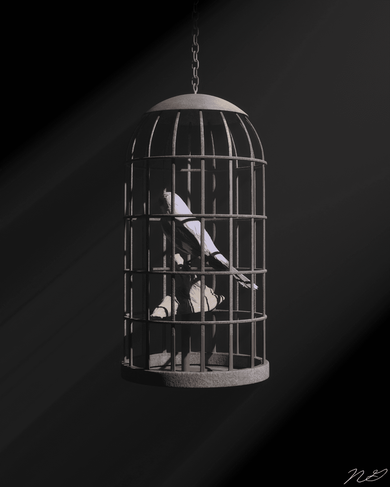
<Carousel slides index onIndexChange label>
- Index
- 0
- Slide
- habitual-confinement
onIndexChange(index)
Code block
Source in a write-up, highlighted on the server in four steps of brightness rather than hue.
float worley(vec3 p) { // p: a position in 3D vec3 i = floor(p); // which cube it's in vec3 f = fract(p); // where inside that cube float d = 1.5; // nearest distance found so far return d;}